
Padyn Humble on roses, romance, and the meaning of blue
Power Ekroth = PE
Padyn Humble = PH
PE: Can you tell me about the background of the film that you’re presenting? How did you choose the title?
PH: The title is ‘taking you out at the knees’. To me this phrase signifies that you have been caught off guard - destabilized - compromised - maybe your strengths were used against you. Most of this happens when you least expect it. I use colloquial phrases, song lyrics, and poetry to title my work. Usually found text - I keep a running list of these in my notes app.
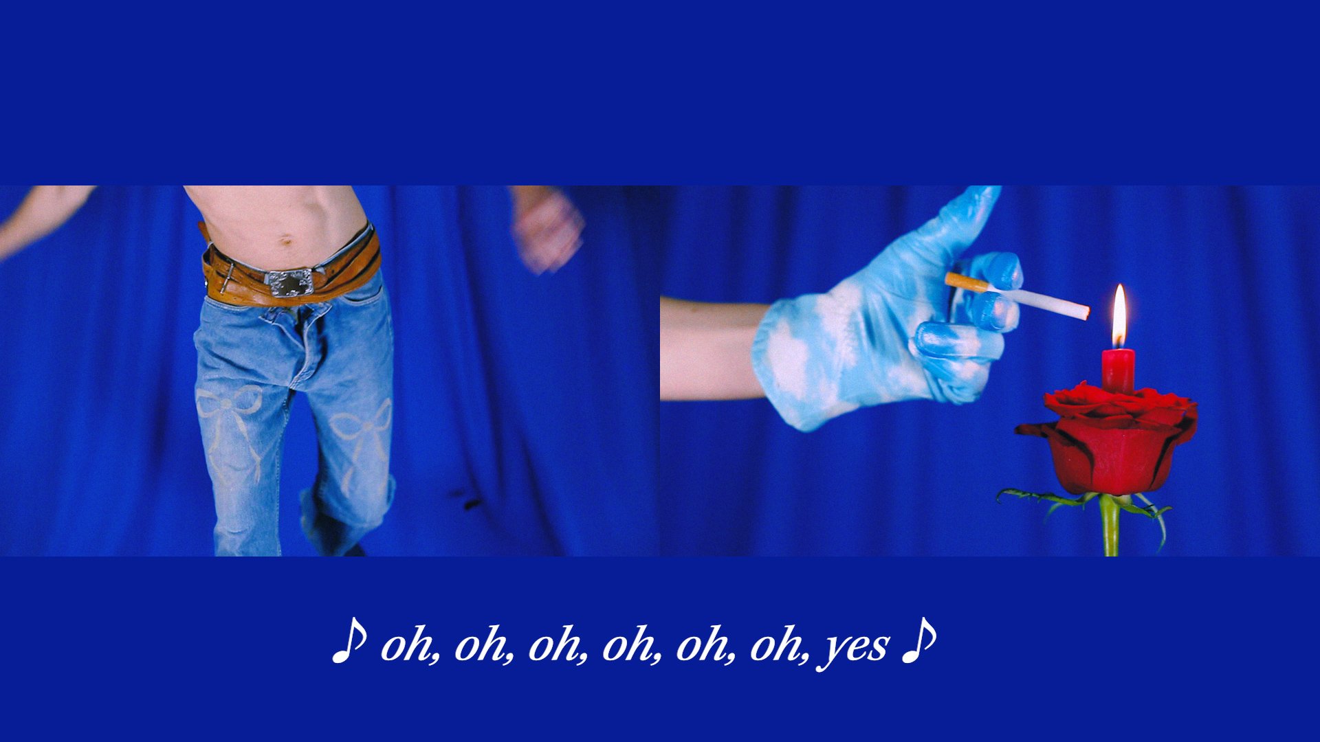
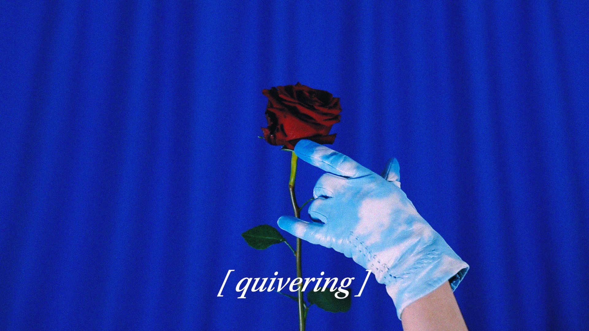
When ‘taking you out at the knees’ came back to me several months ago, I couldn’t drop it. Ultimately I was thinking about the power dynamics of pleasure, pain, or control and also about uncertainty, desire, and care. I wanted to create a dynamic between two characters who could be seen as lovers or maybe the fact that neither of them is identified, they could be an extension of the self. The transfer of these elements between the two can be erotic and sometimes disproportionate. I started seeing romance (the rose) as a tool that they both share. The relationship starts with the sky (gloved character) having most of the upper hand, using the rose against the ‘cowboy’. There’s an element of time and excess here too, both for the amount the rose gets used against to tease or reprimand, but also for the fact that these two symbols, the rose and cowboy, have been romanticized ad-nauseum throughout pop culture. Eventually, we see the power dynamics shift as the video goes on, and the cowboy reasserts himself.
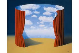
When thinking about the visuals, I saw these simple compositions surrounded in blue where this action could take place. I was inspired by Alex Da Corte’s video, Chelsea Hotel No. 2 (2010) (and his practice as a whole), Karlheinz Weinberger's ‘Jeans’ photography for character design of my cowboy, and Magritte’s paintings depicting curtains floating in space. I imagined a stark relationship between ultramarine blue and the red rose for the whole piece. The shade of blue I chose is the same for ‘blue screens’ when you do video editing. I liked that this quality made the video exist in a detached, surreal ‘location’ where things like desire, lust, or loss can be exaggerated.
René Magritte, Les Mémoires d'un saint, 1960
Karlheinz Weinberger's, Rebel Youth, photos of Swiss youth in the 50s/60s
In my master’s program, I was listening to a ton of 1950s/1960s country music and rockabilly and realized how much blue was used as an emotional signifier for the stories they sang about. Roy Orbison, Conway Twitty, Patsy Cline, Brenda Lee. It’s not news that blue has been used this way in so much film, literature, etc., but it became a good starting point for me to find a thread between all of the objects and narratives. Most of these country artists were singing about loss, longing, and desire, but tinged with a melancholia that I was feeling quite personally. Blue became the emotion and environment for this country persona I created and articulated each narrative through the lyrics and qualities presented in the music. A lot of teardrops disguised in thunderstorms, loneliness under the stars, and hopeful anticipation under the blue sky. That series of work was all called ‘Baby Blue’, and I think there’s something quite pragmatic, reliable, or familiar about that shade of blue.
PE: I know you worked for a long time with roses and also the color blue: why this “obsession”?
PH: Blue has made its way into my work over the last two or three years. It almost feels like a third party at this point - something that needs to be invited or turned away at the start of new work because its presence is so persistent. Most of it started with the color ‘baby blue’ or ‘sky blue’. A lot of it cycles back to the fact that Montana, where I’m from, is considered ‘The Big Sky State’. It’s so expansive and dramatic and informs the landscape in such a cinematic way. Blue references so much about this place and the emotions within that it has become the starting point for most of my recent work. I often imagine each series to exist in specific environments, some of them more real than others, but each unique to the work. For example, a series from 2019 was imagined as the complete boxed set of a toy and its accessories. Each object in that series had a particular identity or function in regards to the ‘main character’. And lately, the environments feel less specified, more abstract, which is why blue’s vastness has been a good addition of tools to work with.
When you take a step back and notice how the sun shines during a bright day, there’s a lot of anticipation or beauty that can be found in this shade that can get taken for granted. So even though the work was rooted in sentimental vulnerability, this optimism or joy was always in the cracks. Since then the shades of blue have been shifting - right now I think I’m in an ultramarine phase - another very common shade, but it’s detached from nature in a way, it feels a little more foreign or manufactured so that when it shows up in the work it is less rooted in the ‘real’.
The roses operate not so dissimilar in a way. Something that can be taken for granted based on its familiarity or availability, but nevertheless a welcome gesture. They are one of the most obvious symbols for romance and there’s something about that clarity I appreciate. Within the work, it can’t be mistaken for what it’s doing, but there is also a ton of room to put this symbol into scenarios that complicate the romantic qualities. I often make roses that have no petals and the identity of the flower is there 100% because of the thorns - so there’s a formal push and pull between pain and pleasure in one.
Padyn Humble, Blue Boy Bathing, 2022.
PE: When I saw outlines for the film “Taking you out…”, I immediately thought of “Un Chant d’Amour” by Jean Genet. Is this a film that inspired you, or had you seen it before making your film?
PH: No, I wasn’t familiar! But after watching it I immediately saw why you might go there. The scenes where they share cigarette smoke through the hole in the wall, all the longing, and constraints on their desire for each other really hit some points I was thinking about. There’s also a scene with a hand grasping for a bouquet that is being swung back and forth which is uncanny to the outline I had made. It’s really gorgeous and erotic - thanks for sharing.
PE: When we met some years ago, I got the impression that your main medium was sculpture. I was so impressed by how you handled the different materials, merging them with each other, and the rather large-scale thinking of installation rather than singular sculptures. Can you say something about how you got into art, and how your art has developed since? Is this the first film you've made?
PH: I think I consider myself a sculptor, absolutely. Initially, I thought I’d be a painter. There weren’t many diverse examples of art practices in Montana - it’s very traditional and wrapped up in Frontier nostalgia.
In undergrad, I had a visiting professor (Elena Lourenco) who really pushed the expectations of sculpture in the department and introduced me to working 3D.
Alex Da Corte, Chelsea Hotel No 2, 2010

I don’t know how to articulate it, but conceiving an object in scale and space made so much sense to my brain. I had a very difficult time with two-dimensional compositions and until that point kept seeing more and more found objects in my paintings. I think it was bound to happen. The department was focused mostly on ceramics and woodworking so of course I tried all of those, but it took another professor and mentor of mine (Maryann Bonjourni) to make a shift in my materials approach. She emphasized that money or the quality of material doesn’t make good work. She manipulated a lot of ‘low’ material in her work and I was enamored with the transformation and camouflage of this.
There is an accessibility to craft material and a lot of intrigue when it can be manipulated beyond recognition which I love. The scarcity mentality has often informed what materials I gravitate towards and I felt compelled to make this process quite uniquely technical and recognizable throughout my work. A lot of trial and error has gone into which ones allow me to achieve this best, but most objects start with foam or cardboard.
Illusion (trompe 'l'oeil) and camouflage are huge parts of what I do. This also comes in with the way I paint my objects. I like false representation, when something reads as ‘real’ across the room and you get up close to find out what’s really going on. This is where my painting background became very helpful. It is incredibly difficult for me to make a ‘raw’ object, something simply from one material or that exposes its material interior. I’m still finding out how the materials and process of my work lock into my content, but mostly it’s wrapped up in the theatricality of the American myths and expectations that I can’t seem to shake.
I don’t want to say I’m not intentional about the scale of my work, but most of the time the measurements happen more organically than I expect. I gravitate towards large-scale work because it is how the object’s size relates to my body. How does it fit between my arms? If it sits on the floor, where on my leg is its height? Is the scale true of the real objects I’m recreating? There are moments when the scale is exaggerated up or down, but if the object doesn’t have a ‘reality’ reference then I find it’s more intuitive to work large, to move around it and get to know it. I take a lot of photos of myself holding my work and seeing how it functions and moves through space even though so much of it is static.
PE: Can you say something about the cowboy inspiration in your earlier work?
PH: The cowboy was the most familiar way for me to reference or characterize the themes present in my work directly. Especially growing up in Montana, these symbols actually functioned and held weight all around me. My name is even from a Western film called Silverado (1985), the main character is Paden. My grandfather has a small ranch with several horses and he does leather working and wood carving in his free time. This ‘character’ or ‘inspiration’ was what I grew up around. I had to find ways to negotiate my queerness and sense of masculinity in spaces designed through ruggedness and political individualism. So much ‘Wild West’ kitsch is decorated in every corner of that place.
PE: When we met you still lived in the US. What made you move to Berlin, and what has it meant for your work?
PH: It’s been quite difficult to see my practice over here actually. I have had my studio longer than any flat at this point so it’s been nice to have my practice be one of the more stable things as I set up over here. I came to Berlin/Europe to be in a space that has more creative infrastructure. To afford myself space and time to design what I think I want for myself. Afford feels like a loaded word considering I’m balancing 5-6 different freelance gigs around my practice, but I think it’s an appropriate word for the fact that I can have almost a 100% creatively focused life here. More access to other artists and people attempting to have free time between all the other demands we have. I get to try a lot of positions and challenge myself in real time, all the time here. It’s hard but I love it.
I am starting to see how the ‘cowboy’ operates on such different levels between the States and Europe. I think the way the States understand these symbols can sometimes feel like they expect this character to be weaponized - the simulacrum has bled into all public facets and has become too painfully real. Here in Germany, I’m interested in looking at the ‘expectation’ of this character based on the way that the iconography has been constructed or appropriated through European media to behave more allegorically. I think this separation will benefit me in the long run - but at first, it was hard to see if the content of my work even fits here or can be renegotiated in a valuable or more nuanced way. OR if I even want to bring this character with me. As I keep working, the less the ‘cowboy’ is actually there or that my work requires it, but the influence is hard to ignore or push through. My brain pattern has been hardwired. We’ll see what happens in the next few years.
Padyn Humble, Ken’s Dream Saloon, 2019
Padyn Humble, Pleaser, 2021
Padyn Humble, Kentucky Rain, 2022
PE: I know that you have been inspired by the DADA movement or the surrealists. What do they mean for you?
PH: I am very inspired by the surrealist movement. Particularly Magritte who distanced himself from the original core surrealists. He writes about how he saw surrealism less as the representation of our subconscious because of how this creates chaos or allows for incoherence. Breton saw surrealism as darker (night/dreams/subconscious) with a more political function, allowing this ambiguity to highlight how terrible they viewed the world around them and Magritte looked for surrealism to utilize light symbolically and literally (surrealism in the sunshine) exposing and enchanting the real. He writes,
“Our mental universe (which contains all we know, feel or are afraid of in the real world we live in) may be enchanting, happy, tragic, comic, etc.We are capable of transforming it and giving it a charm which makes life more valuable. More valuable since life becomes more joyful, thanks to the extraordinary effort needed to create this charm”
Excerpt from Rene Magritte: Selected Writings, by Kathleen Rooney, Eric Plattner
There’s an intention, organization, and optimism in Magritte’s work that I align with. I like his suspension of disbelief held between a point of reality and a little magic. He condenses space and uses camouflage in subtle ways. You could also see the skies in my work as a direct reference to this.
I also quite like Remedios Varo and Leonora Carrington, two surrealists who really push for the ‘magic’.
The interview was made in April 2024


